
Real estate web design - As a top-producing REALTOR®, you want to always refine your practices by keeping up with current trends and studying the best practices closely year after year.
In real estate web design, there are many ways to provide an excellent user experience – make it easy to for your visitors to interact with your website to achieve their goals as well as yours. A good user experience typically involves the following elements:
- Easy to find and access content
- A visual impact that is engaging
- A design that is consistent with the brand identity
- Functionality and features that make task completion seamless
- Responsive and mobile friendly web design
- Content that is constantly updated and relevant to users.
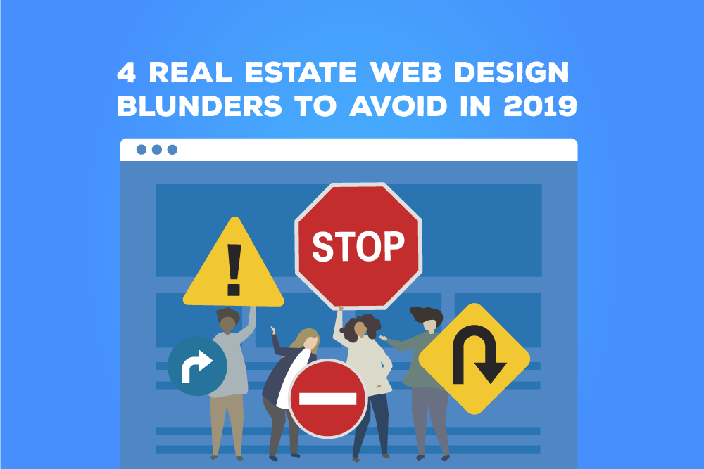
In contrast, there are some tried and tested methods that achieve the opposite user experience. It is important not to fall into the trap to doing things simply because “they have been done by others.” As a top-producing REALTOR®, you want to always refine your practices by keeping up with current trends and studying the best practices closely. The following are 4 real estate web design blunders to avoid in 2019:
-
Don’t Follow the Competition
I am the first to admit that it is tempting to copy what a competitor is already doing. It is a strategy I call, “play it safe”. REALTORS® fall into this blunder often when they think their competitor is doing better than them. In real estate web design and marketing, this practice is frowned upon as it leaves you playing permanent catch up and dubs your website as second best. Your job is to work out what your users and consumers need and taking the lead in creating solutions that meet their needs.
-
Unnecessary Complexity
While trying hard to be extremely creative, web designers pile on design element after design element on their sites. What they fail to understand is that each additional feature element they add, piles on to the misery for the user. Instead of making information more accessible, these ‘creative’ websites actually make it more difficult for users to get the information they are looking for. The rule of thumb in real estate marketing is to make the most important information (i.e. contact information, newsletter subscriptions, address information etc.) accessible in three clicks or less.
-
Lack of Engagement
When people land up on your website, they are there for a reason and that is to interact with you and engage with you on a one-on-one level. Communication should not be a one-way street. In fact, it should be a dialogue between you and your intended audience. That means making it possible for users to contact you through a website contact form, allowing users share your content on their social media channels, offering consumers a one-stop shop for all information they need to make their real estate deal happen etc.
-
Incoherent Call to Action
Your call to action is one of the most important parts of your web and graphic design. It equips your visitors to do something with the information they are reading: Click here! Subscribe here! Get a free market analysis! It is crucial that your call to actions clearly tell visitors what they need to do. There should be enough information that visitors know what they’re going to get from taking action and what information they need to provide.
Did you enjoy this blog post?
Reach out to one of our Real Estate Online Marketing Specialists to learn more about how we can help you grow your real estate business online.


Leave a comment